- Modules
- Background Design
- Composition Principles
Composition Principles
T-DES-002-002
Remember that with only a quick read, the audience should know where they are and have a pretty good idea about what is happening. In other words, your design needs clarity, which can be achieved when it’s based on solid structure and composition principals.
To make your image interesting and have a sense of depth, you can divide it into three different planes: foreground, midground, and background.

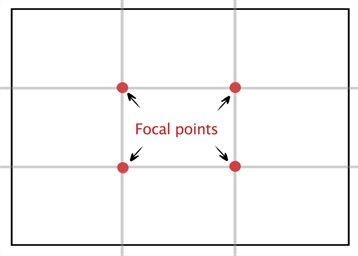
There are a few composition grids available that you can use as the underlying structure for your images. A popular one is the rule of thirds. This guidelines proposes dividing an image into horizontal and vertical thirds to find the focal points, which are located where the lines intersect. The lines themselves are used as reference points to place elements within the image.
As for the placement of the components within the environment, keep in mind that pictures are read in the same way as books: from the top-left to the bottom-right unless elements in the image direct the audience’s eye differently.
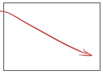
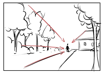
You can also direct the eyes of the audience by strategically placing elements that point toward the main action. For example, you can align the top of the trees so that, if a line was extended from them, it would point at the key event.
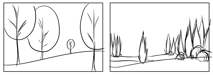
Another option for leading the audience in the right direction is by having contrast among the shapes within the picture. If it’s filled with big trees and there is only one small one, the audience will want to look at the smallest one. If all the trees are grouped together and there is one standing alone, the audience will tend to look at the one standing on its own.
Variation in edges can also impact how the audience will read your image. Their eyes will stop on items with sharp edges and have a tendency to follow it, but they will pass over soft edges without noticing them. So make sure your point of interest has sharp edges and that less important elements don't steal the show because they have soft edges.

An alternative way to put emphasis on where the viewers need to look is colour. On a predominantly cool colour image, you will notice right away where the warm colours are and vice versa.

The careful use of values creates different levels of contrast to lead the audience’s eye through the image and make sure they are looking at what is important. The area of highest contrast attracts the human eye and you need to take advantage of that.
Value is also the best tool in your arsenal for clarity in your images as it allows you to design distinctive silhouettes that will help the viewer to quickly identify what they're looking at.

So, by placing the elements purposefully in an environment, and using contrast of shapes, edges, colours and values, you can make sure the audience is not going to miss anything important to the story.
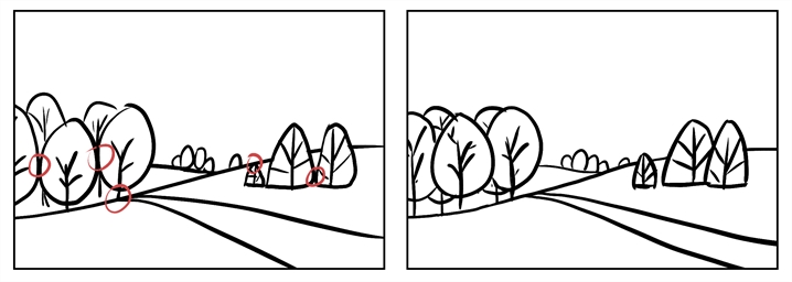
When you design environments, you have all those options to make sure the audience is looking where they should. There is one more thing to keep in mind when tracing the route that the eyes of the viewers will take through your images: unwanted tangents. They will easily distract the audience from looking where they should. So it is important to make sure there are no undesired tangents.
Time Estimated 15 mins
Difficulty Level Beginner