- Modules
- Character Design with Harmony Advanced and Premium
- Relative Size of Characters
Relative Size of Characters
T-DES-001-005
A production can contain many characters and props. It is not unusual for these to be created by different people. If there is no size control implemented, the characters and elements created by different artists can vary greatly. When this occurs, the characters that are placed together in a scene will be out of proportion. The animator or person doing the scene setup will then have to scale them to the correct size.
Once your characters, accessories and props are designed, a "Line up" is created so everyone on the team is aware of the difference in size between the various characters and objects. This ensures that the characters and props stay in proportion from scene to scene and there is an interesting variety in the size and shape of the various elements in your animation.
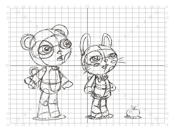
A line up consists of copying and pasting all your character designs into the same drawing and then scaling them to the correct proportion in relation to the other characters. This line up is very important and should be handed to any animator, layout and posing artist or scene setup person working on the project.

For the prop design, it is recommended that you paste one of the main character's hands or even the full body beside the prop. This enables the animator to know what size to draw the prop. The size relation between the props, characters and backgrounds is very important in maintaining consistency and structure throughout the project.

In your character design scene, it is a good idea a layer with the existing character line up as a reference so your new design fit the existing style and size .In cut-out animation, when the character builder imports the model to the rigging scene, the size relation should be correct. The same thing applies when the Assets team imports the rig in the production scenes.
When a character or prop is scaled down, the outline will become increasingly thinner. By the time the element is scaled to its proper size, the outline may be so thin that a difference between one character's outline and the one beside it will not look very good. Therefore, it is also quite important to use consistent brush sizes between designs and designers.
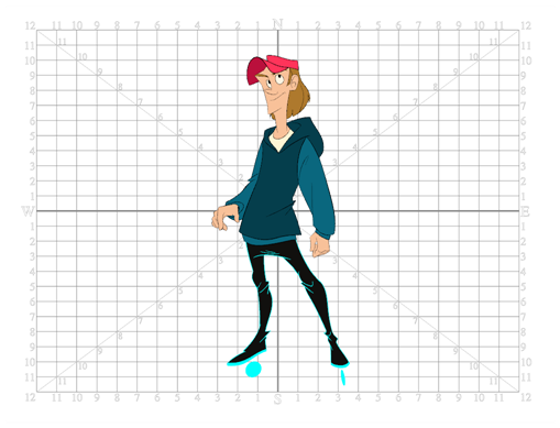
Harmony and most digital design app includes a grid display. This tool is very useful in setting the characters' and props' heights.
It is recommended that you keep the character design and breakdown inside the grid. This ensures that it fits the default camera size and the template thumbnails. If some parts were drawn too big or too far apart, you should scale your design down to fit the recommended size.

Next Topic
Character Design Preparation
Time Estimated 10 mins
Difficulty Level Beginner
Topics List
- Introduction to Character Design
- Character Design Basic Steps
- Character Proportions
- Character Model Sheets
- Relative Size of Characters
- Character Design Preparation
- Activity 1: Sketching a Character
- Activity 2: Creating a Brush Preset
- Activity 3: Sketching the Details
- Activity 4: Tracing the Character
- Activity 5: Deconstructing a Character (Optional)