- Modules
- Colour Styling
- Adding to a Colour Scheme
Adding to a Colour Scheme
T-DES-003-018
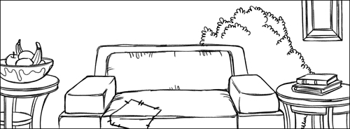
When you feel you have enough to start, pick a colour scheme that feels appropriate for your project and start building your palette with that. Let’s use the living room background (below) as an example.
For an everyday life scene, we want it to be welcoming and warm. Nothing too dramatic. You could use a triad includes two warm colours and one cooler colour (see below).

That’s a fun set! It’s nice and warm and the blue mixes well with the orange.
Once you have those down, go back to your mood or intention and ask yourself what colours fit that description. Start by trying a few colours that are analogous to one of the starter colours and see how that goes.
The beige and brown (below) are two analogous colours of the orange. This keeps the palette warm.

Remember also to pick colours that are light or dark in value. Our first picks are often colours high in chroma, but you have to give yourself the chance to have at least one colour that is the lightest option and one that is the darkest option. It will allow you to have contrast in your piece.
We also like this twist on colour palette building: have fun with proportions. A great way to use colour is to use each one in different quantities. Maybe your scene is almost all blue and purple, but there is this small window filled with yellow light. An illustration like this might have a palette that looks like this:

Can you feel the purple taking over the scene with proportions like this?
By using swatches of different length, you will have a whole new look at your colour palette. Don’t hesitate to play with the proportions to see what the same colours can do for you! Here is how we imagine our warm living room colours with proportions now:

It's the same palette but it gives a different vibe doesn’t it?
Next Topic
Thumbnailing
Time Estimated 15 mins
Difficulty Level Beginner
Topics List
- Introduction to Colour Styling
- Design Organization
- Basic Colour Theory
- Colour Anatomy
- Standard Colour Wheel
- Yurmby Colour Wheel
- Colour Schemes
- Monochromatic Colour Scheme
- Complementary Colour Scheme
- Analogous Colour Scheme
- Triadic Colour Scheme
- Split Complementary Colour Scheme
- Tetradic Colour Scheme
- Warm and Cool Colour Scheme
- How Our Brain Understands Colours
- Building a Simple Palette
- Preparing Your Research
- Adding to a Colour Scheme
- Thumbnailing
- Gamut Mapping
- Activity 1: Creating a Colour Palette
- Activity 2: Creating a Five-Colour Palette
- Activity 3: Painting a Colour Model