- Modules
- Background Design
- Perspective
Perspective
T-DES-002-005
In addition to all the research and composition decisions you have to make in order for your background to serve the story, you also need to convey a sense of space for the spectator to believe in the worlds you’re creating. This can be achieved with the careful use of perspective.
You can use three different types of perspective to get a feeling of dimension within your design: the three simple space indication principals, the linear perspective and the atmospheric perspective. Very often, all of them are used at the same time to different degrees depending on the result you're after.
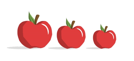
To illustrate the three simple space indication principals, let's start with three objects of the same size.

The simplest way to show distance between two objects is by overlapping them. The object being overlapped will be perceived as being further away than the one overlapping it.

The second method relates to the size of objects. When one is smaller than the other, and we know they are of similar size, the smallest one will feel as if it is farther away.

The third simple principal has to do with the position of objects within the page. The ones located lower than the others will be perceived as being closer than the higher ones.

You can also combine these three simple principals, and by doing so, create a nice sense of space.

Next Topic
Linear Perspective
Time Estimated 15 mins
Difficulty Level Beginner