- Modules
- Colour Styling
- How Our Brain Understands Colours
How Our Brain Understands Colours
T-DES-003-015
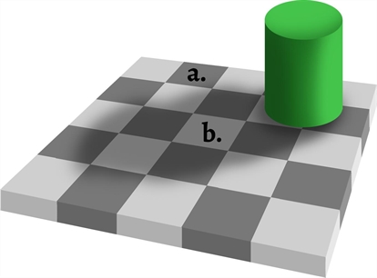
You’ve probably seen this graphic before online or in a book. It seems to be unbelievable that two swatches that appear completely different, are in fact the exact same colour. The following illustration is a well known illusion of colour. Square A and B are the same colour even though our brain tells us A is darker than B.
We would argue here, based on those same principals, that a carrot is also not always orange. Below are two different colour schemes of the same scene. Even though the colour is different, we read is as orange.
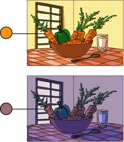
When we read both images, we think: the carrots are orange. Yet when we pick the colour, the carrots are orange only in the first image. In the second image, the colour is more of a desaturated pink. The reason is simple. The juxtaposition of colour tricks our brain into thinking that an object is a particular colour. The color grey is particularly versatile because it can be perceived as so many things. All you need to know is which colour will be beside.
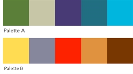
On palette A, the warm grey will give the impression of being a yellow-green, while the grey on palette B looks purple next to all the warm colours.
This concept is key. If you understand this principle, then you are not stuck using the colours that you think an object needs to be. Instead, you can use a colour that will give the impression it is of that colour. You can then focus on building a strong colour palette first and use that palette to your advantage.
It’s important to observe what is around you. If you look at your environment during an overcast day, you’ll see that colours stay quite true to their nature. But as soon as you have any type of dramatic lighting or lack of lighting, colours start to change, yet your brain will still tell you otherwise.
Time Estimated 15 mins
Difficulty Level Beginner
Topics List
- Introduction to Colour Styling
- Design Organization
- Basic Colour Theory
- Colour Anatomy
- Standard Colour Wheel
- Yurmby Colour Wheel
- Colour Schemes
- Monochromatic Colour Scheme
- Complementary Colour Scheme
- Analogous Colour Scheme
- Triadic Colour Scheme
- Split Complementary Colour Scheme
- Tetradic Colour Scheme
- Warm and Cool Colour Scheme
- How Our Brain Understands Colours
- Building a Simple Palette
- Preparing Your Research
- Adding to a Colour Scheme
- Thumbnailing
- Gamut Mapping
- Activity 1: Creating a Colour Palette
- Activity 2: Creating a Five-Colour Palette
- Activity 3: Painting a Colour Model