- Modules
- Colour Styling
- Warm and Cool Colour Scheme
Warm and Cool Colour Scheme
T-DES-003-014
Colours are also considered warm or cool. And another fun way to play with colours and to play with this duality. For example, you could do a full illustration in warm colours, yet do the shadows with a cool colour or vice versa. Or maybe everything in a scene is set on a warm summer day full of yellows and oranges, except for that cool (and refreshing) glass of water on the table with a hint of blue?
Warm colours often suggest energy, fire, and sunshine.
Cool colours on the other end will be more about stillness, winter, night time, or darkness.
The following illustration show a basic scheme of warm and cool colours.

Keep in mind that the juxtaposition of two colours can change the warmth of one or the other. It is also very much a matter of context. The most chameleon of colours when it comes to warmth are often red and green because they can easily be both warm or cool depending on how you use them.
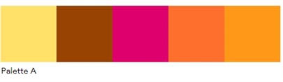
Palette A (below) has warm colours, yet the pinkish red in the middle seems to be fairly cool compared to the rest.
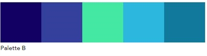
Palette B has cool colours. The blue-green in the middle would usually be considered a cool colour, but next to the whole set, it feels warm.
Time Estimated 10 mins
Difficulty Level Beginner
Topics List
- Introduction to Colour Styling
- Design Organization
- Basic Colour Theory
- Colour Anatomy
- Standard Colour Wheel
- Yurmby Colour Wheel
- Colour Schemes
- Monochromatic Colour Scheme
- Complementary Colour Scheme
- Analogous Colour Scheme
- Triadic Colour Scheme
- Split Complementary Colour Scheme
- Tetradic Colour Scheme
- Warm and Cool Colour Scheme
- How Our Brain Understands Colours
- Building a Simple Palette
- Preparing Your Research
- Adding to a Colour Scheme
- Thumbnailing
- Gamut Mapping
- Activity 1: Creating a Colour Palette
- Activity 2: Creating a Five-Colour Palette
- Activity 3: Painting a Colour Model